WCM Connect App
A self-initiated concept redesign — reworking an existing patient app's onboarding, dashboard, and scheduling from its public App Store reviews.
Overview
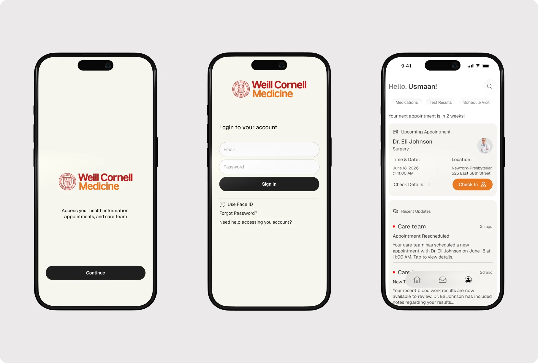
Healthcare apps should help patients feel informed and in control—not overwhelmed. Reviewing WCM Connect's App Store reviews revealed recurring complaints around authentication friction, confusing navigation, and difficulty accessing health information. Rather than a full redesign, I focused on the moments that shape a patient's first impression and everyday experience—using interaction design, clearer information hierarchy, and better system feedback to reduce friction throughout the journey.
Outcome
This redesign explored how thoughtful UX can make healthcare feel more approachable, focusing on improving the experience patients already rely on rather than adding new features. Simplifying onboarding, reorganizing the dashboard around high-priority tasks, and streamlining appointment scheduling reduced friction, while clearer visual hierarchy and consistent system feedback made the experience more intuitive and reassuring.
The project reinforced that healthcare design is about reducing uncertainty, not just clean interfaces—patients often engage during stressful, time-sensitive moments, where clarity and trust matter as much as functionality. It also strengthened my ability to translate qualitative feedback into product decisions that balance user needs, accessibility, and business constraints.
Problem
Patients rely on WCM Connect to manage appointments, medications, and communicate with their care team, yet many reported struggling with basic tasks. App Store review analysis surfaced three consistent themes: authentication friction, with repeated login issues, confusing verification flows, and unclear error messages; difficult navigation, with medications, appointments, and messages requiring too many steps to reach; and limited feedback, leaving users uncertain whether their actions had actually completed.
Research & Direction
I began with publicly available App Store reviews rather than assumptions. Login failures, password reset frustration, confusing onboarding, slow appointment access, difficult messaging, and unclear dashboard organization showed where patients struggled most—shaping three redesign goals: simplify onboarding without sacrificing trust, improve dashboard usability so key information is immediate, and make scheduling easier end to end. Three principles guided every screen: clarity over complexity (one primary action per view), accessible healthcare (type, spacing, and contrast for all ages and technical comfort), and building confidence through clear system feedback.
Solutions
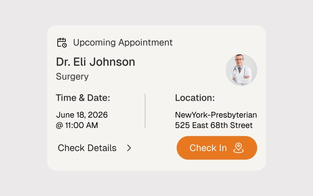
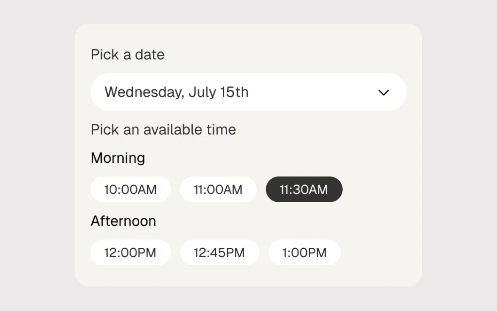
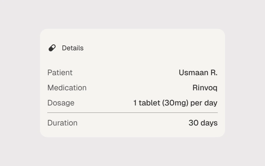
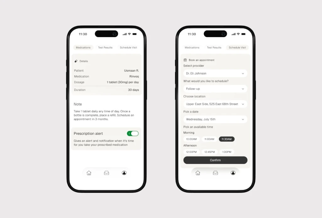
The redesign focused on three high-impact areas of the patient experience: onboarding, with simplified authentication, clearer hierarchy, and improved system feedback to reduce first-time friction; the dashboard, reorganized around patients' most common tasks so appointments, medications, and test results are easier to access; and appointment scheduling, streamlined with a clearer step-by-step flow, simplified provider selection, and more reassuring confirmation states.
Accessibility
Healthcare products serve users with a wide range of technical abilities. The redesign emphasizes larger touch targets, improved typography hierarchy, higher color contrast, clearer labels, reduced cognitive load, and consistent spacing throughout the interface.
Design Systems
To maintain consistency, I established a small component system including buttons, form fields, cards, status indicators, navigation components, appointment cards, and message previews—improving scalability for future product development.