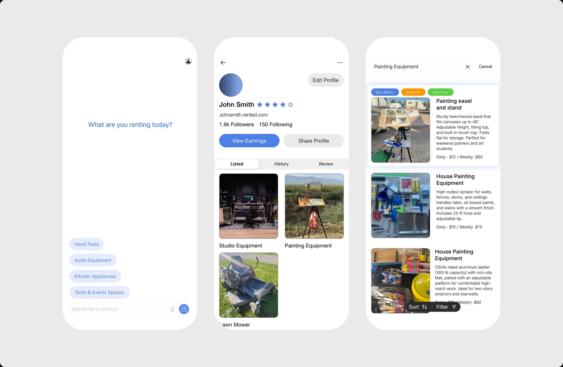
Hi, I'm Usmaan, a Product Designer based in Queens, NY. I design digital products that feel effortless to use, pairing sharp visual craft with a deep interest in how people actually interact with software. I work across mobile and web, from early research through prototyping and hand-off. I also run On The Run Studio, where I collaborate with clients on websites and brand-forward web experiences.
Rented
Case Study
Designing peer-to-peer rental experience for urban renters.
RoleProduct Designer
DurationNov 2024 - Feb 2025
ScopeProduct DesignUser ResearchPrototyping
CollaboratorsSoftware Engineers
ToolsFigmaPlay 2
Overview
Most people own tools and gear they use once, then store forever. Rented lets neighbors lend and borrow instead. I was sole designer across onboarding, browse, PDPs, and profiles, from November 2024 to engineering handoff in February 2025.
Problem
The P2P rental market has two failure modes. Apps like Hygglo front-load heavy verification and lose users before they ever browse. Apps like Craigslist skip trust entirely and feel unsafe at stranger-to-stranger scale. Neither handles the person who wants to rent their drill out on Tuesday and borrow a camera on Saturday.
Onboarding Friction Most platforms front-load heavy verification or skip it entirely. None balance fast onboarding with trustworthiness.
Two-Sided Role Support No platform handles the renter-to-lister duality well. You're either buying or selling, never both seamlessly.
Cross-Category Browsing Every app struggles to make browsing feel clear across wildly diverse item types — tools, cameras, camping gear, party supplies.
1
Onboarding Friction
Most platforms front-load heavy verification or skip it entirely. None balance fast onboarding with trustworthiness.
2
Two-Sided Role Support
No platform handles the renter-to-lister duality well. You're either buying or selling, never both seamlessly.
3
Cross-Category Browsing
Every app struggles to make browsing feel clear across wildly diverse item types — tools, cameras, camping gear, party supplies.
Competitive Analysis
Research
Two rounds of comparative user sessions — Round 1 with 4 participants (3 in-person, 1 async), Round 2 with 3 of the same participants on a revised prototype.
I started by asking how participants used resale platforms they already knew (eBay, Grailed, Depop), then walked them through competitor rental apps before handing them an early Rented prototype to compare directly.
Three patterns held across the sessions:
Minimal Search Won: Cluttered filters and dense forms killed momentum. Participants who used Depop most often cited its search simplicity as the reason.
Role-Switching Is the Point: Every participant described themselves as someone who'd both list and rent depending on the week. Every competitor forced a buyer-or-seller framing.
Long Catalogs Caused Drop-Off: Users got fatigued scrolling flat browse surfaces. Multiple asked for "something at the top that's actually for me."
Conventional auth flow, basic search, simple profile — identifying what needed to change.
Onboarding — SSO front-and-center (Apple, Google, Facebook), followed by a single category prompt — "What are you renting today?" — that gets a new user browse-ready in under a minute without a verification wall.
TProfiles — Tabbed layout (Listed · Currently Renting · History · Reviews) holds both roles as equal rather than defaulting to one. PDP surfaces the lister's profile and rating immediately below the imagery — trust at the point of decision.
Browse — the surface that changed most between rounds.
Round 1 was a flat search-and-scroll catalog. Round 2 added two changes:
"Best Match" section above the catalog, surfacing items matched to a user's budget, timeframe, and location. This came directly from Round 1 — users were dropping off in long scrolls and asking for a curated entry point. Round 2 participants engaged with Best Match first in every session.
Suggestion tags above the search input. Not from user requests — from competitive design reference and a judgment call about whitespace and search friction. Round 2 participants used the tags more than direct text input.
The unresolved piece — filter and sort across mixed inventory — was the surface I wanted more time on. A drill and a tent need filters that share almost nothing.
Outcome
Handoff included an interactive prototype, a design system and component library, and annotated core flows. We aligned on onboarding, profiles, and PDPs. The outstanding ask was a simpler explore surface with filter and sort for mixed inventory. Build paused when engineering reprioritized.
What I'd push further:
More user sessions on browse and filter — 3 participants validated direction, not enough to settle mixed-inventory filtering.
Bring the lister experience to the same fidelity as the renter experience.
Build out trust infrastructure — ratings, verification, transaction history.
Redesigning a non-profit website to better serve the Muslim youth community.
RoleUI Designer & Project Manager
DurationNov 2023 - Nov 2025
ScopeUI/UX DesignProject ManagementUser Research
PlatformWebflow
ToolsFigmaWebflow
Overview
The National Muslim Youth Association is a non-profit whose website hosts religious teachings, event materials, and program resources visited by youth members nationally. I was brought on to maintain the site, but after assessing its state — cluttered navigation, outdated content, and active malware — I proposed and led a full redesign.
Problem
Years of content updates without structural cleanup left the site hard to navigate. Parents couldn't find teaching materials. Youth skipped the site entirely. The WordPress build had malware issues that made maintenance risky. The site needed to be rebuilt from the ground up — new platform, new IA, new design system.
Old NAA UINew NAA design
Wireframe & Development
I began working on wireframes for the new website, researching and solving the major pain points users were facing. Once the board approved the final wireframes, I developed the site on Webflow — incorporating the organization's logo colors and assets, introducing additional colors for the interface, and prioritizing accessibility across screen sizes, particularly mobile devices and tablets.
User Research
While developing the new website, I conducted user research groups. I collaborated with small focus groups, providing them with an early prototype. This helped me understand how users navigated and interacted with the site, and compare their behavior against the old website.
Research insight map
Research groups revealed three recurring friction points: people needed clearer paths to updates, easier access to materials, and a mobile experience that felt more engaging.
01
Parents
Event announcements
Parents found it difficult to stay up to date with events happening at their local mosque.
Navigating the website
Many parents had limited technology experience, making page navigation feel unclear.
Essential materials
Important resources were difficult to find and access from the old website structure.
02
Teachers
Teaching materials
Teachers needed a faster way to locate presentations and class resources.
Class data entry
Inputting class data into national spreadsheets was difficult alongside lesson prep.
Navigation
Teachers also ran into the same navigation issues parents experienced.
03
Youth
Engagement
Youth visitors did not find the old website exciting enough to return often.
Mobile access
Many accessed the website on mobile, where key materials were harder to reach.
The final version launched in June 2024. After a few months, traffic increased by ~30% as users became familiar with the site. Youth visitors rose due to the interactive sections on various pages. Parents and teachers found it much easier to navigate. I continue to manage, enhance, and maintain the website.
On The Run Studio is a design studio that began as a personal project to curate and share images that inspired me and my work. Over time, the page grew and built a community of like-minded individuals who found inspiration in the posts. Along the way, I designed and produced products and merchandise inspired by these influences. On The Run Studio continues to share, inspire, and grow the community while connecting with brands and companies to assist in web design and development.
On The Run Studio Mobile UI
Merchandise
For 2 and a half years, I designed and produced merchandise inspired by my upbringing and the images I had curated. I started off with a t-shirt and a mug. For the t-shirt, I created a design that was simple and clean — the graphic was inspired by the Unisphere in Flushing, NY. For the mug, I placed the early On The Run Studio logo on the front.
Web Development
The On The Run Studio website was hosted on Shopify initially for the first year and a half. The following year, I redesigned and hosted the website on Squarespace. After another year and a half, I moved to Framer for a few months. Currently, the website is hosted on my own domain and is built with HTML, CSS, and JavaScript.
Design Studio
On The Run Studio is continuing as a design agency to assist brands and companies to strategically design and develop their websites. The agency provides a full-service design and development solution, from initial design to launch and ongoing maintenance.
Web Design & Marketing for a Brooklyn-based brand.
RoleWeb Designer
DurationNov 2025 - Present
ScopeWeb DesignCampaignsMarketing
CollaboratorsBrand Founder
ToolsFigmaShopify
Overview
Adsum is a Brooklyn, NY-based brand. I design landing pages for new collections, sales, and events on an ongoing timeline. Additionally, I assist with launching new campaigns and assist with outreach. I work closely with the brand's founder.
Landing Pages
I designed landing pages for the brand's new collections and releases, as well as for the holiday sale announcements. Each page is crafted to match the brand's visual identity while driving conversion.
Size Filter Feature
Size Filter
I designed and developed a size filter feature for the collection pages, enabling customers to filter products by their sizes and see what is available. This reduced friction in the shopping experience and helped customers quickly find items in their size.
Additional Work
Beyond web design, I have created graphic designs for the brand's email announcements — including Black Friday and Cyber Monday campaigns — and assist with ongoing marketing outreach and social media content.
A browseable archive for curated visual reference and inspiration.
RoleDesigner & Developer
TimelinePersonal project
ScopeUI DesignFront-end buildContent structure
CollaboratorsIndependent
FigmaCursorClaude Code
Overview
A personal archive for reference imagery I return to: work I admire, compositions I want to study, and visual cues that shape my own practice. The site wraps the collection in a quiet, archive-style UI that's quick to scan and easy to grow.
Design & build
The project began in Figma, where I worked out the layout hierarchy, type, spacing, and the small system of components that holds the grid together. From there I built it out in HTML, CSS, and JavaScript, with the collection driven by a single images.json file so adding new work is a one-line change. The pacing is deliberate: tight grids where browsing benefits from density, generous space where a single image deserves to stand on its own.
Image Library - Judd
Filter Feature
Each image is tagged by medium in images.json, which populates the filter dropdown automatically. As the library grows and new tags appear, the filters update with it. No manual upkeep, no dead options.
Image Library Filter UIImage Library Filter in motion
Reflection
Working with Cursor and Claude Code alongside Figma changed the rhythm of the project. Figma still anchors the thinking, the layout decisions and the system, but smaller refinements and one-off ideas now move straight from thought to working code. It's made the gap between "what if it did this" and seeing it on screen shorter than it's ever been, and it's quietly shifted how I scope personal work: less precious about the first draft, more willing to try things.